In today’s digital age, email marketing remains one of the most effective ways to engage with your audience. However, with the majority of people opening emails on their mobile devices, it’s crucial to design emails that are not only visually appealing but also responsive and user-friendly. In this blog, we’ll dive into the key design factors, layout techniques, and best practices for creating engaging and responsive emails that drive results.
1. Email Design Factors
Single Column Layout
The ideal width for a single-column layout is between 500-650 pixels. This ensures that your email is easily readable on mobile devices, which is where most people open their emails. A single-column layout helps maintain a clean and organized structure, making it easier for recipients to navigate through the content.
Images and Graphics
Images play a vital role in email design, but they need to be used wisely:
-
Utilize deep colors available on smartphones to make your images pop.
-
Ensure that the images match the email message and communicate a benefit or idea to the recipient.
-
Keep image files small to avoid slow loading times.
-
Use alternative text to describe the image for those who might have trouble seeing your content.
-
Avoid using background images as they may not render well across all devices.
-
Ensure that images do not make up more than 30% of your email content.
-
Include clear call-to-action (CTA) and messaging within the image.
-
Scale images up to 600 pixels to ensure they look sharp on all devices.
2. Inverted Pyramid Structure
 |
 |
The inverted pyramid is a structural element that focuses the user’s attention on your call-to-action (CTA). It starts with an image or headline, followed by content, and ends with a clear CTA. This structure ensures that the most important information is seen first, increasing the likelihood of engagement.
3. Preheader Best Practices
The preheader is the information displayed in the email preview, usually within 100 characters or less. It should support the subject line and provide additional context to entice the recipient to open the email. Avoid using default messages and remove any unnecessary or repetitive information.
Examples of Effective Preheaders:
-
Air copyright: "Check in online now. Save time at the airport."
-
Heathrow Airport: "What’s happening at Heathrow? A taste of Spring."
-
Harbor Freight Tools: "Your Exclusive April Coupons Have Arrived!
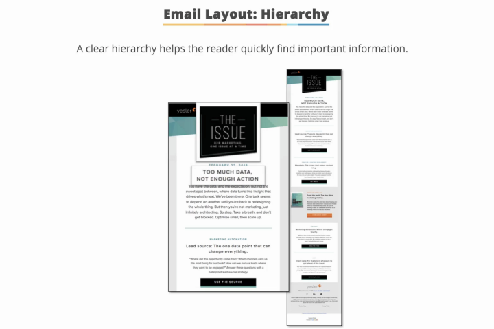
4. Email Layout: Hierarchy
A clear hierarchy in your email layout helps readers quickly find important information. Use headlines, subheadings, and body copy with appropriate font sizes:
-
Headlines: 22 pixels
-
Subheadings: 18–20 pixels
-
Body copy: At least 13 pixels
 |
 |
Ensure that your email has a logical flow, guiding the reader from one element to the next.
5. Call-to-Action (CTA) Design
Your CTA buttons should be big, bold, and clear. They should stand out from the rest of the content and use action-oriented language to encourage clicks. The CTA button should be at least 45 x 45 pixels, with 40-60 pixels of white space around it to make it more visible.
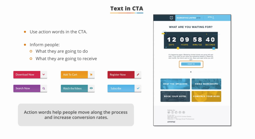
CTA Text Tips:
-
Get It Now," "Sign Up Today," or "Join Now
-
Inform recipients what they will do or receive by clicking the button.
6. Choosing the Right Color Palette
Color increases brand recognition by 80% and triggers emotional associations. Choose a consistent color scheme that aligns with your brand and use it throughout your email. Online tools like Adobe’s Color Wheel can help you develop a clear and consistent color palette.

Types of Color Palettes:
-
Analogous: Colors that are positioned side by side on the color wheel.
-
Monochromatic: Different shades and tones of a single base color.
-
Complementary: Colors that are opposite each other on the color wheel, creating striking contrasts.

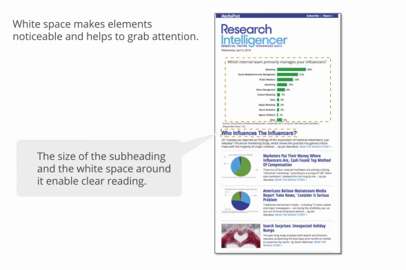
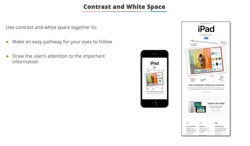
7. White Space and Contrast
White space increases reading comprehension by 20% and makes your email look professional. It helps in creating a clear separation between elements and guides the reader’s eye through the content.
Contrast:
 |
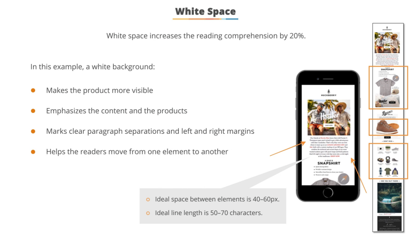 |
-
Use contrast in subjects, headlines, and images to grab the user’s attention.
-
Important information should be in high contrast to ensure it stands out.
8. Optimizing Text for Readability
No one reads every word in an email. Recipients scan sentences and avoid long paragraphs. To optimize your text:
-
Write short sentences and paragraphs.
-
Use clear line breaks and focus on spacing between paragraphs.
-
Make the text legible with proper spacing around it.
-
Use left-aligned text for both headlines and content, as it’s easier to read.
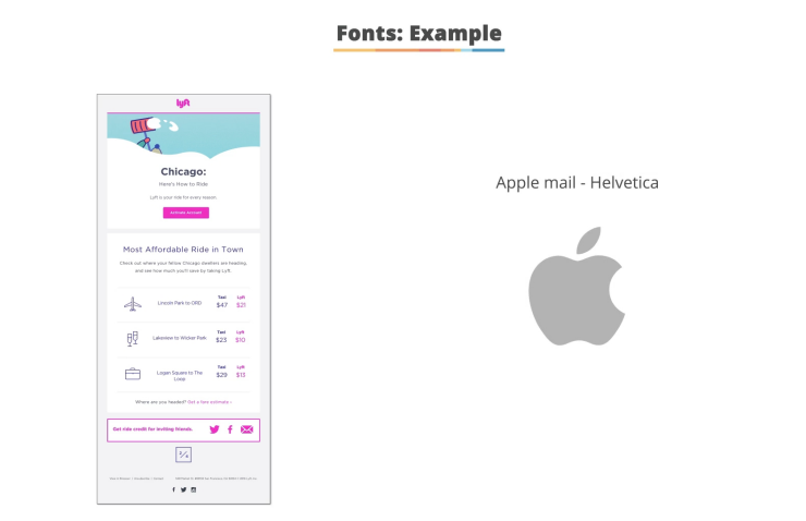
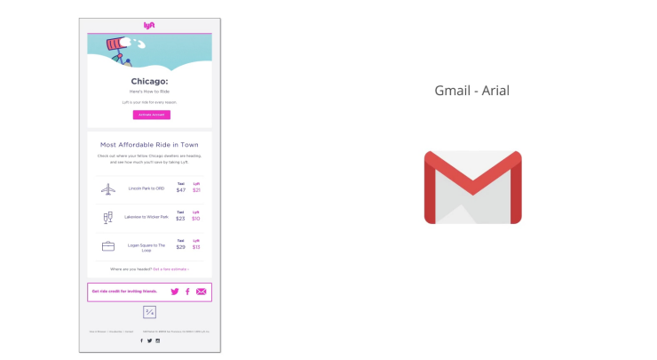
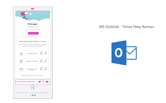
9. Choosing the Right Font
-
Serif fonts (e.g., Times New Roman) are ideal for long blocks of text.
-
Sans serif fonts (e.g., Arial, Helvetica) are better for headlines and online content, as they are easier to read on digital devices.
 |
 |
 |
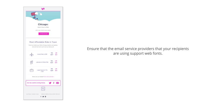 |
Web Fonts:

You can use Google Fonts for better legibility and consistent branding. Tools like Google Fonts allow you to load custom fonts that enhance the look of your emails.
10. Responsive Emails


With 65% of users starting their email journey on a smartphone, it’s essential to create responsive emails that adapt to any device. Responsive emails ensure that your content is displayed correctly, regardless of the device or email client.
Best Practices for Responsive Emails:
-
Use default templates provided by email service providers.
-
Test your emails on different devices before sending.
-
Use responsive code to ensure your emails render accurately across all devices.
11. Wearables and Plain Text Emails
For smartwatches and other wearables, plain text emails are more suitable as they don’t use a browser. Ensure that the message and CTA are clear and easy to read on smaller screens.

Conclusion

FAQs
1. Why is a single-column layout recommended for email design?
A single-column layout, ideally between 500-650 pixels wide, is recommended because it ensures that your email is easily readable on mobile devices, where most people open their emails. It also helps maintain a clean and organized structure, making it easier for recipients to navigate through the content.
2. How can I optimize images in my emails?
- Keep image files small to avoid slow loading times.
- Use alternative text to describe the image for accessibility.
- Ensure images match the email message and communicate a benefit or idea.
- Avoid background images, as they may not render well across all devices.
- Scale images up to 600 pixels to ensure they look sharp on all devices.
3. What is the inverted pyramid structure in email design?
The inverted pyramid structure focuses the user’s attention on your call-to-action (CTA). It starts with an image or headline, followed by content, and ends with a clear CTA. This structure ensures that the most important information is seen first, increasing the likelihood of engagement.
4. How important is the preheader in email marketing?
The preheader is crucial as it provides additional context to the subject line and entices the recipient to open the email. It should be concise (within 100 characters) and support the subject line, avoiding default or repetitive messages
Tags: Email Marketing Delhi Best Email Tools India Digital Marketing Delhi 600 pixels Marketing automation Email Campaign Software Email Marketing Services E-mailing marketing Email campaign services Email blast service Top Email Tools Email Marketing Strategy call-to-action (CTA) times new roman font Delhi Marketing Tools
Comments on “Mastering Advanced Email Marketing: Design, Engagement, and Responsive Emails”